Pages

Thursday, May 31, 2007

Fan Club: Reinhard Engels


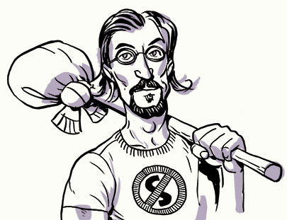
Here is a person who is a bit of a personal hero of mine. Reinhard Engels created the No S Diet and the Shovelglove Workout, as well as a number of other systems at his network of websites, Everyday Systems.

The main reason I think he's cool is that he has a very appealing philosophy of simplicity in his ideas, all wrapped around an even-easier-to-understand metaphor, pun, or visual image. To a person who multitasks so poorly as to almost consider it impossible, simple ideas that don't need to be thought about very often are like gold. Heck, you can tell his ideas are simple just by going to the websites; they're delightfully unencumbered by design.

I've been doing the No S diet for about a year and a half now, and I lost about 10-15 pounds (I wasn't that heavy to begin with), and best of all, I no longer consider myself to be on a diet. I've also been doing Shovelglove for a couple weeks, and I'm ever so slightly burlier. What I appreciate more than any particular progress, however, is that there's a built-in set of rules that are simple, precise, easy to follow, and easily scheduled in. As he mentions on one of his podcasts (also charmingly low-tech; you can hear his cats in the background), habits are there to reduce your time, effort, and thought, not increase them.

Last of all, for a de facto (but not self-proclaimed) diet guru, he's refreshingly self-effacing. He's not the sort of diet coach that pumps you up to make a herculean effort to get skinny for swimsuit season, he's the guy saying, "I was lazy and fat; here's a ridiculously simple way you can be just a touch less lazy and gradually lose weight (or get stronger, or drink less, etc.)." Check out his site. You may find a system that makes sense to you, as well.

Comics Tips and Tricks: Create Your Own Handwriting Font

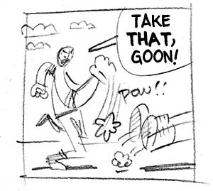
Zander and I are staunch advocates of hand-lettering, but that doesn't mean "font" has to be a four-letter word.

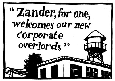
If you've got nine bucks to spare, consider building a font based on your hand lettering. While we wouldn't recommend using it for your next graphic novel, consider these scenarios:

COMMERCIAL WORK
Try using your clean, clear handwriting font on commercial storyboards, especially if you're working at a stage where the design department hasn't decided on the final font yet.


LAYOUTS
If you have to turn in layouts or sketches of your next comic or graphic novel, consider using a font version of your handwriting instead of quickly scratched text or empty balloons. The publisher will get a better sense of what the book will end up looking like and you can play around with varying balloon widths.

SHEER LAZINESS
So your aunt in Dubuque wants a "cartoony" invitation for your cousin's Spiderman-themed birthday party? Since your entire audience for this project will consist of people who will be fooled by your hand-lettered font, why not use it? There's nothing wrong with phoning it in once in a while.

THE GIFT THAT KEEPS ON GIVING
Speaking of your Aunt in Dubuque, why not make a font of her handwriting and give it to her for Christmas? I think custom fonts defintely fall under the "Say -- I didn't even know you could do that!" category. And with a ttf format, she should find it pretty easy to load on her Dell.
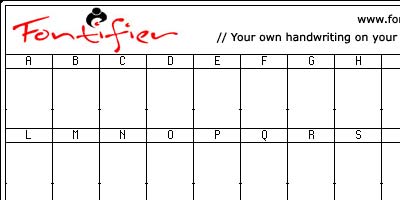
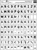
After a very quick google search we found fontifier, a fast and easy way to make a true type font for your use. Fontifier has you write out the alphabet on a specialized template, which you then scan in and upload to their site. Their compu-bots make a font out of your sheet in less than a minute.

Some highlights:

  • Only $9. PayPal or credit card. Cheap enough that you can make several fonts, or even several drafts of one font for less than the price of a night on the town.
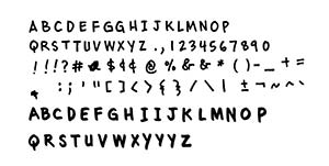
  • Flexibility with customization. The font I made is all caps, so on the template I put uppercase roman as "lowercase" and uppercase bold as "uppercase." Also, want to draw a smiley face, or something not on the template? Try putting it in place of a character you may not use, like the British Pound.
  • Works on mac and PC.
  • Their terms of use says all ownership goes to you. So unless the fontifier people are big jerks, I don't forsee them selling your handwriting on the black market.


A note on the template: I wrote all of my letters on graph paper first, sometimes printing an individual letter two or three times until I got it right. Then I scanned it in at 600 dpi and dropped my best letters onto the template in Photoshop. (I had up-res'ed the template to 600 dpi as well.) When I had my template finished I dropped down the image size to 150 dpi or so on bicubic.

There are other make-a-font programs out there, but they seemed either too DIY on the programming end or prohibitively expensive (for recreational use, anyway). Zander and I aren't getting any cash from Fontifier, so if you know of other good programs, let us know!

Monday, May 28, 2007

Everything You Need to Know about San Diego Comic-Con

Holy smokes, not only does Mr. Spurgeon give an exhaustive (and -ing) prep course for this year's San Diego Comic-Con, he squeezes in a couple of Zander Cannon references. I won't tell you where they're hidden, but one involves a candid shot of Zander scratching his ear, and the other involves a sandwich.

We'll be posting more about San Diego as we near the July 25 launch date: where we'll be, what we'll be selling, and what we'll be wearing.

Friday, May 18, 2007

Fan Club: Garth Marenghi

Those Cannon boys! You'd think they just sit in their ivory tower, disseminating wisdom and edjimacation to all the boys and girls of the world, but the truth is, they love the culture around them, pop and otherwise. Here they get the chance to express their admiration for something, someone, somewhere, and try to convince you that it's totally cool.

Garth Marenghi


Welcome, traveler!

Garth Marenghi's Darkplace is a British horror show that aired last year on the SciFi channel in the US. Darkplace is a show within a show-- supposedly the brainchild of a Clive Barker/Neil Gaiman/Warren Ellis-like horror writer named Garth Marenghi-- that was "too damn scary" to be released in the decade it was produced.

"Only now, in the worst artistic drought in broadcast history," says Marenghi, Darkplace has been rereleased, with the episodes interspersed with interviews with the cast, including the mystery of what happened to the female lead. Any fans of Peter Jackson's older low-budget horror work will dig this very self-conscious, very funny send-up on 80s drama, the horror genre, and charmingly self-important horror writers. I was hooked from the moment I saw the first episode-- I love it so much I can't even see the wires!

Unfortunately for those of us in the US, there is no Region 1 version of the DVD, but you can watch the first episode on the SciFi website, and the other episodes are available on YouTube.

Earn a Degree While You Work!

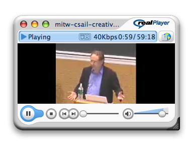
I love drawing all day, but I miss the barrage of academic stimulation that I took for granted at Grinnell. Having NPR on in the background helps keep my brain from becoming soup, which is a real plus, but occasionally I want something a little deeper and a little more on-demand. That's why I've been on a big lecture kick lately. Thanks to the power of the internet, one can magically transport themselves into the back row of an Ivy League lecture hall -- for free.
The goldmine for me is the MIT World site, which offers full lectures in a wide range of disciplines. How about "Descent into Limbo" with Maurice Sendak? Or "Mammalian Cloning and Stem Cell Therapy: Problems and Promise" with Rudolf Jaenisch?


Let me know if you have found any other great caches...

Thursday, May 17, 2007

Sketch Challenge: 700 Pirates

The Cannon boys are cartoonists. That's what they are and what they do. They draw all day and dream about drawing all night. They can draw anything you can think of. They will draw things you have never heard of. They will draw a box. They will draw in socks. SKETCH CHALLENGE GO!

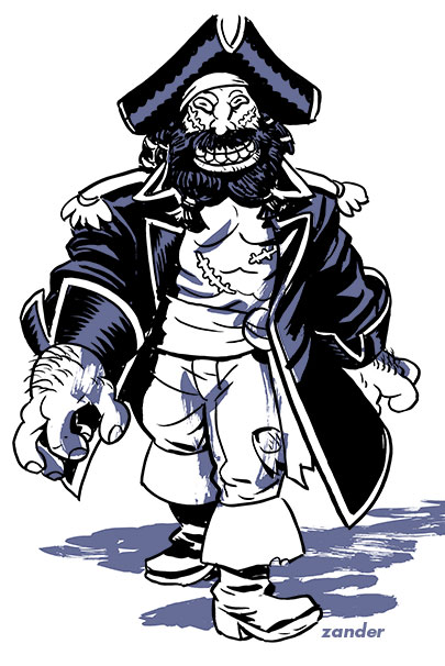
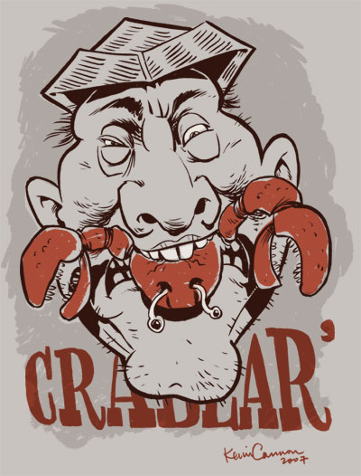
Today Zander and Kevin are drawing for the 700 Pirates Flickr Set.


Mutinous Marley is not the guy you want to give your crew a little pep talk. Just the fact that he has all of his limbs and both eyes is a dead giveaway right there.


Crabbeard doesn't know the difference between a crab and a lobster. Crabbeard spells his own name as Crabear'. Crabbeard is a chef and specializes in ortolan.

Wednesday, May 16, 2007

Are They Brothers? Part 4

Zander Cannon and Kevin Cannon claim not to be brothers. But they both live in Minnesota, are both over six feet tall, both went to Grinnell College, and are both cartoonists. Not brothers?? Not likely!! So here at Big Time Attic, we've decided to do a little bit of extremely scientific testing to find out the truth once and for all.
If there's any test that will TRULY determine whether Zander and I are actually brothers, The OC test is sure to be it. In fact, the core theme of the show revolves around two cool dudes who are brothers in every way except by birth -- just like me and Z! LOL!
For those of you who haven't seen the show, and you're rolling your eyes right now, let me admit that yes, it was a teen soap opera. But unlike its 90210 older cousin, the OC had quick wit (often ad-libbed), a fourth wall-breaking self-deprecating sense of humor, and even featured a long-running story arc about one of the characters working for Wildstorm. Not too far off the mark from ol' BTA, eh?

And if you're still not convinced that you should take this show seriously, Ira Glass raved about the OC on a recent "This American Life" after which he had Mates of State cover the show's theme song ... so there you go.

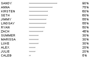
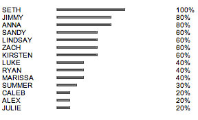
Moving on to the test (which can be found here), a result of Seth/Ryan would prove past a shadow of a doubt that Zander and I are brothers, and in all honestly we could stop taking these tests. Seth, of course, is a cartoonist who plays video games all the time (Zander), and Ryan is a ladies man who broods a lot and often looks at things out of the corner of his eye (me).

CONCLUSION:

Well, it looks like we'll keep taking the test in coming weeks ...

ZANDER'S RESULT:


A loyal husband, caring lawyer and supportive father, Sandy Cohen is the rock of The OC. His words of wisdom and humorous, laid back attitude are always appreciated.


KEVIN'S RESULT:


Everyone loves Seth Cohen. Always good for a laugh, always there for Ryan and finally winning over the ladies, Seth brings enjoyment to every scene that he participates in. Although Seth was raised in the wealthy, sometimes superficial environment of Newport, he's very down to earth and caring.

This scientific test claims that Zander and I have a father/son relationship, not a brotherly one.

Brotherhood Likelihood: 23%

Now if you don't mind, Zander has a troubled teen to take under his wing and I have to go run away in my sailboat.

Monday, May 14, 2007

Sunday, May 13, 2007

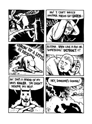
Far Arden: Chapter Eight

Witness the latest installment of Far Arden, a novel of love and regret in the Canadian arctic.

In chapter eight ... discover the secret of Alistair's father, watch Pinho set the Areopagitica on a doomed course, and grab a first row seat for an honest-to-goodness man-on-polar bear fight-to-the-death!


Read Chapter Eight.
Start from the beginning.

Thursday, May 10, 2007

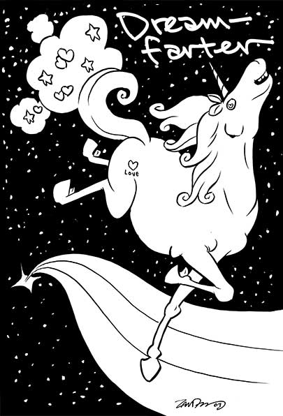
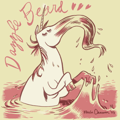
Sketch Challenge: 700 Unicorns

The Cannon boys are cartoonists. That's what they are and what they do. They draw all day and dream about drawing all night. They can draw anything you can think of. They will draw things you have never heard of. They will draw a box. They will draw in socks. SKETCH CHALLENGE GO!

Today the Cannon boys are drawing for the 700 Unicorns Flickr Set.

ZANDER:


Welcome, children! Shall I summon a dream for you? A misty lovely-land of sights and sounds and yes, smells in which you can sigh your cares away. Wonderful! Follow meeeeeeeeee!!!!!!

KEVIN:


Dazzle Beard is a jerk.

Wednesday, May 09, 2007

Are They Brothers? part 3

Zander Cannon and Kevin Cannon claim not to be brothers. But they both live in Minnesota, are both over six feet tall, both went to Grinnell College, and are both cartoonists. Not brothers?? Not likely!! So here at Big Time Attic, we've decided to do a little bit of extremely scientific testing to find out the truth once and for all.

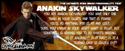
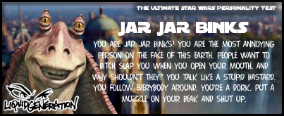
Star Wars! Star Wars! Star Wars! Man, I love Star Wars. I sure hope we're cool, awesome characters. On with the test, which is Liquid Generation's Star Wars Personality Test. Those guys at Liquid Generation sure seem like reasonable, knowledgeable folks. Man, I can't wait to find out what characters we are.

KEVIN'S RESULT:


KEVIN SAYS: I'm Anakin, huh? I guess it's 'cause I have all those romulan pellets in my system or whatever they're called. So when do I get to meet Padme?

ZANDER'S RESULT:


ZANDER SAYS: Son. Of. A bitch.

RESULTS: Despite the fact that this test is clearly flawed... somehow... the Cannon Boys seem to both be from the lame prequels, both whine a lot, and both made Episode I unwatchable crap. Thanks a lot, us, you jerks! Looks like the pendulum has swung the other way--

Brotherhood Likelihood: 74%

Monday, May 07, 2007

Comics Tips and Tricks: Aesthetics of Lettering Part 1

Lettering in comic books has undergone a fundamental change in the last ten years, and like most changes in most artistic disciplines, it is summarized in one word: COMPUTERS.

Though you'll find the people who aesthetically prefer computer lettering to hand-lettering to be a distinct minority, the simple fact is that computer lettering is here to stay. The reasons are good ones; computers are consistent, are (relatively) easy, and allow people to do the work without having to physically work on the originals, freeing up time for the pencillers and inkers. The big advantage, then, is saving time. The big problem, of course, is a damaged aesthetic. The problems with computer lettering are twofold.

1) Artists are working on finished artwork that is inherently unfinished.

When lettering is physically done on the page, the artist has to plan in the pencilling stages where it will go. The letterer then puts the lettering down there on the page, and the inker has to then work around it. The artwork at the final stage (inking) takes into account the presence of the word balloons, even if that means nudging some elements one way or another.

With computer lettering, the artwork never goes to the letterer-- just a scan so that they can start putting the balloons down. Obviously, the penciller, who is placing all of the elements in the panel, should be thinking just as much about where the word balloons go as he would with hand-lettering, and he probably is-- it's just that his mistakes are not the inker's problem anymore. The problem is: when the finished artwork is done, inked, and colored, and everything balances, then suddenly a huge number of graphical elements --all the word balloons-- are dropped in over the top of it. Sometimes this means that huge areas of beautifully inked background elements are covered. Sometimes this means that the color/shadow balance of the panel is thrown off. It always means that one of the most important parts of the panel is not specifically planned in.

2) In the name of expediency, sometimes it's non-letterers that are doing the lettering.

Back when computers first started having the power and software to do lettering on comic artwork, certain savvy hand-letterers saw the writing on the wall, so to speak, and made at least part of their business computer-driven, creating on their computer fonts, sound effects, balloon shapes, color effects, etc. In the process, they created studios filled with people who, although they may be smart and have a good aesthetic, are not practiced letterers. This was particularly the case with comic publishers, who saw no reason to pay letterers a page rate when they can just have an intern drop the stuff in on whatever production computer they have lying around.

The effect of this move, typically, was a mismatch between the comparatively rough and organic artwork and the mathematically precise lettering and word balloons. Perfect ovals fitting around human shapes; rigidly straight balloon pointers cutting across faces; unalterable balloons sticking out of panel borders. To most people it's not terribly noticeable, but it can often have a disorienting effect, sometimes to the point of confusing the order in which balloons, and panels, should be read.

Join us next week for the:

The Scale of Lettering Aesthetics

Big Time Attic: The Comic